Between the Bindings
Contents
The atlas consists of 59 map sheets. You can peruse the table of contents (in Russian and French) via the David Rumsey Luna Browser embedded below or click "go to source" for a larger view. You might need to wait a second or two once zooming in for the image to refocus.

Sheet Order
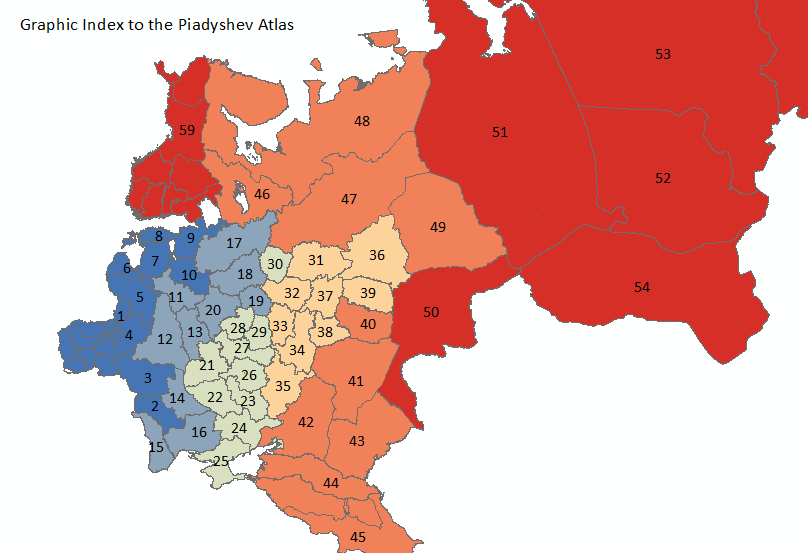
Here is a different take on the table of contents. This map provides a graphic index to the atlas, mapping sheet numbers onto the provinces they represent.
It comes as little surprise that the atlas begins in the west and works (for the most part) eastward. It is the vertical stacking of the sheets, visualized in color below, that strikes me as noteworthy.
The north-south orientation makes good sense in the context of a bound atlas, where proceeding through geographical space in consistent, logical order would allow a reader to navigate mentally. But in more abstract terms it represents a refreshing deviation from the horizontal axis structuring so much of what we think about the nature and identity of the empire. The series of lines descending into the southern reaches of Eurasia recall both the geographical perspective of the tsars looking out from their northern palace and the ancient Greek understanding of a world divided between north and south, darkness and light, snow and sun.
Chronology of Map Preparation
This map shows the year in which each sheet was produced. The dates range from 1820 to 1826.
The west-to-east progression is clear. But is it meaningful? Does it reflect (an imperial) hierarchy of significance? Does it hold that the later the sheet was produced, the lesser the significance of the territory it described? Perhaps that is reading too much into a meager bit of evidence.
Perhaps, instead, the chronology of map preparation suggests an evolution in cartographic expertise? Why not start with the low-hanging fruit and then move on to tackle the more challenging maps? The relatively late mapping of the Grand Duchy of Finland and the Caucasus, which present unique challenges due, respectively, to their coastal and and mountainous geography, might support this observation. (A bit of digging in the archives would, of course, yield the answers.)
Map Design
To get a sense of the original layout and physicality of the atlas sheets, explore this annotated image of Moscow Province. (Be sure to pan and zoom in order to find the annotations closer to the margins of the image, or go to the fullscreen version.)
Take a closer look at a sample legend (excerpted from the Moscow sheet). Be sure to pan, zoom, and click to make your way around the whole image.
No digital object can replace the materiality of the printed atlas. Gone are its heft and odor, the texture of each page, the sound of each page turning. Our task is to bring the atlas to life in new ways. To transpose it into a digital medium and take stock of its reinvented look and feel.
The atlas has shed its bindings. What has it gained in return?