Orientations
Let's start with a very simple map addressing a very complex question: where do we draw the line between the "core" and the "periphery" of the empire? In this brief mapping I want to take this oft-debated question in a slightly different direction; I want to see what we might learn about exteriority and interiority by looking at the empire in spatial (rather than ethnic, cultural, or political) terms.
To that end, here is a map of all uezdy/counties adjacent to the border of the empire itself. Those whose boundaries overlap with some portion of the imperial border appear in green; the rest appear in yellow. Of the 614 total uezdy, 147 (24%) are adjacent to the border.
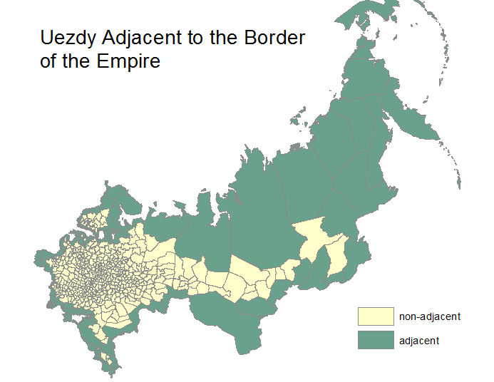
Interestingly enough, the adjacent uezdy cover 72% (almost 14 million square kilometers) of the total area of the empire.
(Technical note: Throughout this map series I use only the data extracted from the atlas. Here I've calculated uezd area in square kilometers from the feature geometry rather than pasting in areas calculated by Russian officials in the 1820s. All spatial analysis and calculations were done in equidistant conic projection.)
In other words, this map tells us that there were far more administrative units (and therefore, perhaps, more state power) in the interior part of the empire. However, the vast majority of the empire - in terms of areaa - was adjacent to the border and might then, be thought to have some measure of "exteriority". (More on this a bit later.)
Of course, it tells us this because it is solely interested in differentiating between counties that are, and are not, adjacent to the border. Even a summary glance reveals that the astoundingly large area in the former category is easily explained and has everything to do with the inclusion of the Siberian lands.
This map, then, gives us an incredibly crude measure of the distinction between inner and outer territories, or between what we might package up into the ideas of interiority and exteriority.
So let's take a different approach. What about if we decided that the way to get a sense of whether a chunk of imperial territory had an outward or external orientation (which would not, of course, exclude the possibility that it also had an internal orientation) was to analyze the strip of territory within 10 kilometers of the border?
Let's say we were to draw a thick orange line (or created a buffer, in GIS-speak) to demarcate the ten kilometers closest to the border... all the way around the empire. It might look something like this:

Now we can see the (well-intentioned) folly of working at the level of uezdy. In many cases uezdy, or counties, share only small stretches of the imperial border: including the entire territory of such a county on our map means that we are assuming that the border is as relevant 40 or 50 kilometers as it is 10 kilometers away.
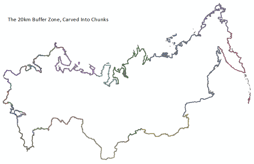
Setting that aside, let's say we decide that a 20-kilometer buffer makes more sense. A human can cover 20 kilometers on foot over the course of a single day. Terrain, weather conditions, fitness, and baggage could prevent serious obstacles, but we will set those variables aside for the moment. Here is what it might look like if we drew an even thicker line - this one in a nice shade referred to by ArcMap as "cantaloupe":
Now what?
What if we could figure out how many settlements of one kind or another fell within that 20km buffer, and how the distribution of those settlements compared across the empire?
The map below shows the settlements represented on the Piadyshev atlas overlaid on the 20km buffer (that juicy cantaloupe line). For kicks, we are shifting our gaze to the southwestern region of the empire:
Next, let's select those settlements that fall within the buffer (in the map below they go from blue to red):
Now, we can eliminate the remaining settlements:
... and count the number of settlements in each administrative unit. First, let's look at the distribution of border settlements across provinces:
The Grand Duchy of Finland is the runaway winner with 261. This is not terribly surprising, given the substantial overlap between imperial border and provincial perimeter. However, Orenburg province - quite a stranger to the mainstream historical limelight - takes second place with 98. Beyond that, we can see that the western border of the empire contains far more settlements within its buffer zone than does the eastern border. (This is one of a great many maps that shows the utter lack of positive correlation between size (area) and settlement in the Russian Empire.)
If we push a bit harder on the data and drill down to the uezd level, does the picture remain the same?
It turns out that scale does matter. As this map suggests, it is almost always the case that the more fine-grained the data, the more productive the insights. We effectively moved from looking at 26 provinces to 120 counties and as a result we now have a much better sense of the distribution of settlements along the imperial border.
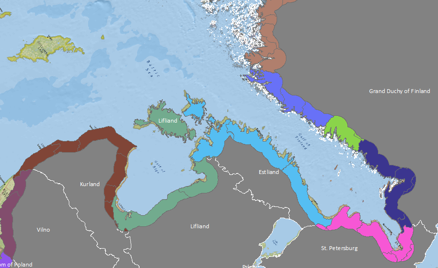
If we zoom in on the western portion of the empire, some interesting things begin to emerge.
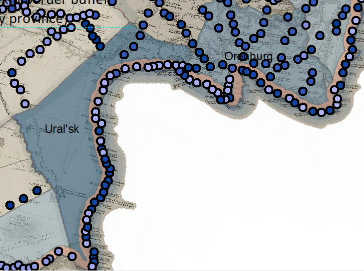
While it is correct to say that Finland had far more border settlements than any other province, it is far more accurate to say that the northwest and southern coastal counties of Finland had a similar number of border settlements as did the counties of Estliand and a scattering of counties in Bessarabia, Tavrida, Orenburg, and Kamchatka. In fact, the true "hotspot" of border settlements was Ural'sk county in Orenburg province. (I am willing to bet that even those of you with a deep knowledge of Russian history would not have come up with that guess.)
The map doesn't provide an exhaustive explanation of why Ural'sk is such a hotspot. But it provides some clues.
First, as you can see, all but 3 blue dots (representing settlements of various sorts) are located within the 20km border buffer.
Second, there is a significant difference between the interior area of Uralsk and that of Orenburg county just to the north, which is criss-crossed with settlements within and beyond the border buffer area.
By contrast, settlement in Uralsk occurs exclusively along the border. And in fact, if you zoom in far enough (not possible on this particular map fragment, though you can do it on the interactive version), you will see that the southeastern border of Uralsk couty is the Ural River. And if we assume that the Ural is like most rivers, the reason for the settlement pattern begins to make sense.
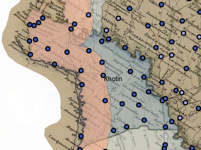
We all know the dangers of assuming. Sure enough, just when it might seem reasonable to expect concentrated settlement along river courses, we stumble upon a county such as Khotin in northern Bessarabia. Khotin's (south)western border is the Prut River, but unlike in Uralsk, settlements are distributed evenly across Khotin.
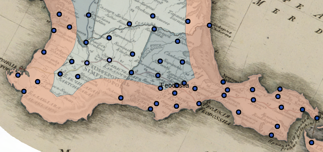
The county's narrow width explains why the 20km buffer caught so many settlements in its net. The same could be said for other counties as well, where narrow and/or coastal locations cause them to stand out. Feodosiia county on the Crimean peninsula (Tavrida province) is a good example of this:
Let's drill down one last time. If shifting from province as unit-of-analysis to county as unit-of-analysis was productive, why not eliminate all of the uezd territory that does not fall within our nifty 20km buffer and focus on the buffer areas themselves?
We can carve up that nice long cantaloupe line into chunks according to the boundary lines of the counties.
Let's zoom in to get a better look:
Now we can look at the settlement densities:
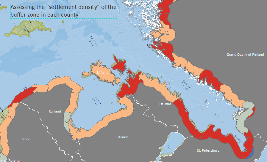
Moving back out the whole empire, here are the summary findings:
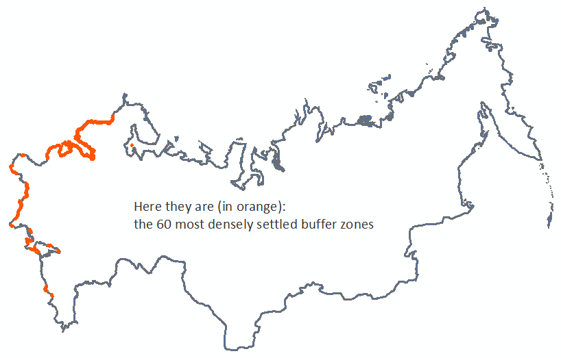
Only 120 counties had settlements within the buffer zone; this map shows the top half. The next map shows the top 10.
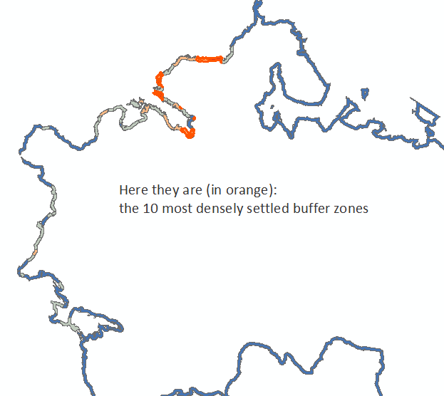
(Are you wondering why Ural'sk dropped off the map, so to speak? It turns out those 41 settlements were spread over 15,275 square kilometers, yielding a density that ranked #64. In terms of pure buffer size, Ural'sk came in at #14.)
Takeaways
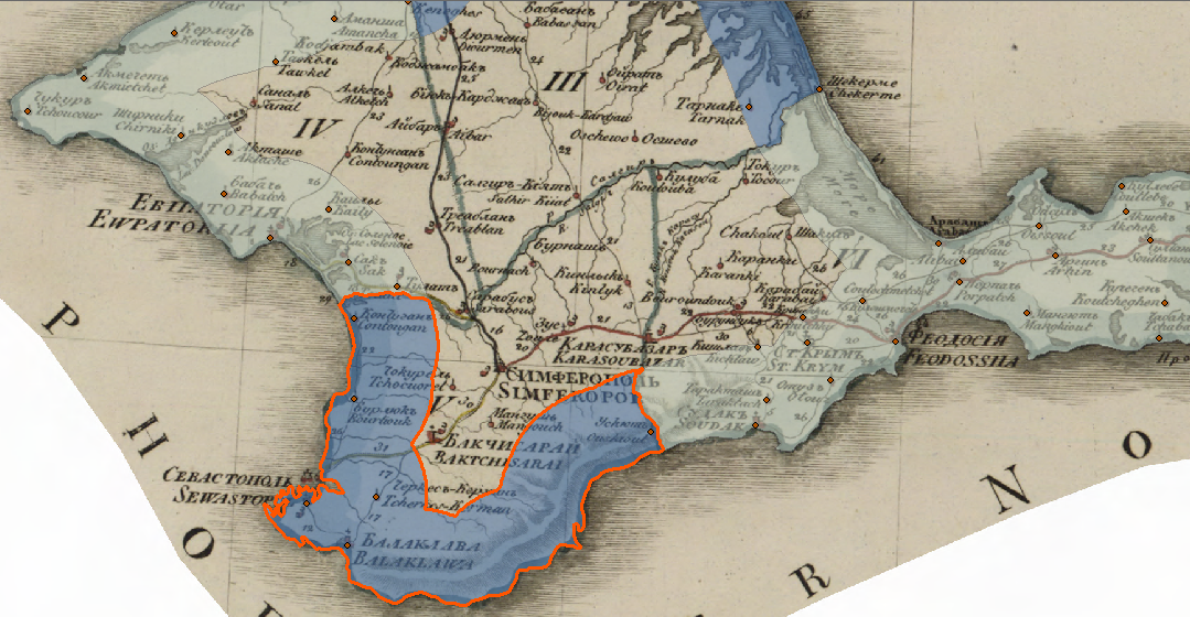
First, working on the atlas in this way allows us to unpack it and begin asking critical questions of the atlas as a historical source. While there are any number of idiosyncrasies and remarkable features, as a historian of Crimea I found it striking that Simferopol did not emerge at the top of the list of counties in Tavrida province. It turns out that Evpatoriia and Feodosiia have larger buffer areas, and 15 and 21 settlements, respectively, while there were only six settlements in Simferopol's buffer area. This I found puzzling. Six settlements in a county liberally spread with villages from Sevastopol to Alushta?
Sure enough, the Piadyshev atlas shows only six settlements within the 20km buffer zone. Here is the same area, shown on a topographical map produced in 1817 (just a few years prior to the atlas sheet):
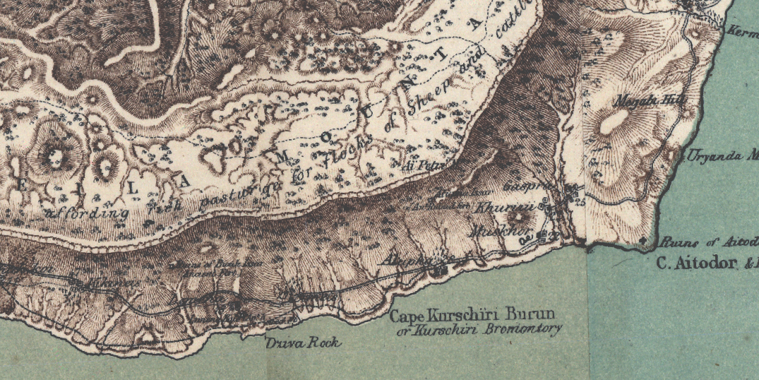
The takeaway? The atlas is a powerful tool, but not a comprehensive source. On its own, it can only tell us so much. When compared with a topographical map, executed at a much larger scale, a sheet from a general atlas is little more than an index to the inhabited spaces - and any number of other features - of a given province. The strength of Piadyshev's magnum opus lies not in exhaustive detail, but in its ability to render the fundamental spatial structure of the empire (adjacencies, connections, proximities, etc.) in the form of a map.
Second, we come back full circle to the idea of adjacency floated at the beginning of this essay. The idea was to isolate counties that shared the border of the empire from those that did not. (I described these administrative units as "adjacent" to the border, though technically their perimeters overlap the border.) The second step was to find a meaningful way to work with the selected units, and here is where we come to the takeaway. While they remain the building blocks, we are not confined to the units of the atlas. We are free to seek out implicit conceptualizations of space, and even introduce new geometries in an effort to make them explicit.
Here we invented a 20km buffer area in order to extract information that would otherwise have remained embedded. The total area within the buffer (meant as a rough measure of "border space") was shy of 909,000 square kilometers - a far cry from the 14 million square kilometers covered in our initial measure of the area of all uezdy adjacent to the border. Whether or not this invention generated a more accurate measure of border space or of outward-facing potential, it generated new perspectives, and new questions for further research.
Finally, this mapping opens as many questions as it answers about what defines the significance of borders. Settlement density is the key to most symbolization schemes and the maps would therefore seem to argue that settlement density is the key indicator of the significance of a certain stretch of border territory. But what would we learn if we parsed out the settlement types? Would we find that administrative centers are more prevalent in border areas or interior spaces? What if we took into consideration the maritime or terrestrial nature of each border segment? What if we measured proximity to post roads or named rivers - would we find significant differences between areas with and without access to the border of the empire?
Spatial questions, in other words, beget more spatial questions. Just as maps, I am increasingly convinced, beget more maps.