The Rogue Map
Rogue-ishness is relative (and fascinating, and occasionally dangerous.) If you are trying to identify outliers, this is the tool for you.
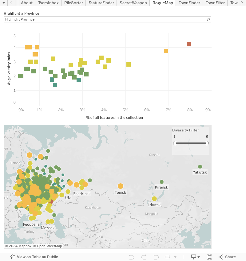
The town plans lay out a stylized, official, vision of Russian urban space. Yet judging from the variety of colors on the graphs below, that vision was not entirely uniform. Within a given province, one town might offer a dozen different features - everything from canals to almhouses - while the rest have nothing but a church and an old earthern wall. In another province, all towns might exhibit a high level of feature diversity yet account for a very small piece of the full dataset. The data is, when it comes down to it, full of curiosities. For example, it might not have occured to you that Podolia (in western Ukraine) and Yakutsk (eastern Siberia) have much in common, but the plans claim otherwise.
To dig in, select a province from the highlighter tool or by clicking in the scatter plot. The map will respond, showing the relevant town set. Better still, when the province's colored square is highlighted, click on it directly: the map will zoom in to the area making it easier to see the town distribution.
Use the filter tool in the bottom right of the map to assess the distribution of towns with variying levels of feature diversity. (And you can always zoom and pan around the map.)